 View Details
Signs & Banners
Rectangular Decals
Starting at
$160
Rectangular decals make efficient use of space compared to most other standard shapes — no rounded corners cutting into the layout, no wasted margin the way a circle or oval leaves around a square logo. That efficiency is why the shape is the default for anything carrying more than a single icon or short line: instructional text, multi-line contact information, warning labels, or a layout with several elements that need to line up cleanly against straight edges.
- Category
- Signs & Banners
- Customization
- Free design & proofing
- Finishing
- Die-cut, glue & score incl.
- Lamination
- Gloss / matte available
Free proof before production — flat view, 3D mock-up or hard copy
Custom size, stock and finish on every order
Dedicated support through production and shipping
Full Description
Of all the shapes decals get ordered in, a rectangle wastes the least space. A circle or oval leaves empty margin in the corners of whatever bounding box holds the design, and that margin either goes unused or forces the actual content to shrink to fit inside the curve. A rectangle uses its full area edge to edge, which is why it's the default shape for anything that needs to carry more than a single icon or a short line of text — multi-line contact information, a list of instructions, a warning label with both an icon and explanatory text, or any layout with several elements that need to line up against straight edges.
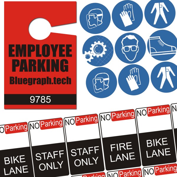
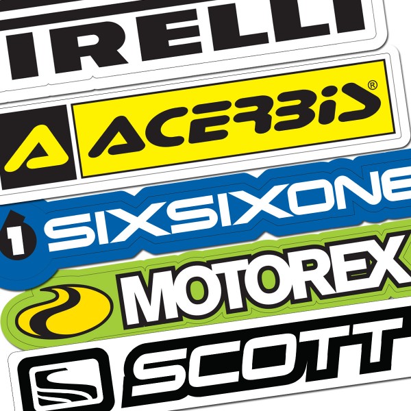
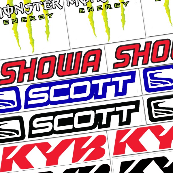
That efficiency shows up most clearly in a few common applications. A bumper sticker is almost always a wide rectangle, since the format matches how the message is meant to be read — left to right, at a glance, from the car behind. Equipment and asset labels tend toward a rectangle too, since they often carry a model number, a barcode or QR code, and a line or two of specification text that needs its own space rather than competing for room inside a circle. Warning and instructional labels follow the same logic: an icon on one side, text on the other, both needing enough flat area to stay legible.
Aspect ratio is the main design decision with a rectangular decal, and it should follow the content rather than an arbitrary standard. A short label with a logo and one line of text works fine close to square. Something built for a shelf edge, a door frame or a bumper needs to run wide and short. A vertical rectangle suits a sign meant to be read while walking past rather than driving by. Working out how much text and imagery actually needs to fit is the fastest way to land on the right proportions before finalizing a design.
Material, adhesive and lamination choices follow the same options as any other decal shape — full-color printing on vinyl, permanent or removable adhesive depending on the application, and a laminate finish for anything that needs to survive outdoor exposure or frequent handling. Rounded corners are a common variation on a straight rectangle, since they hold up slightly better against peeling and chipping during handling and shipping than a sharp 90-degree corner does.
When ordering, working from the actual content — how much text, how many elements, what it needs to sit next to — is the most reliable way to land on a size and proportion that reads clearly rather than picking a shape first and squeezing the design to fit.
You Might Also Need