
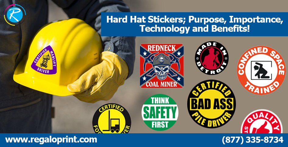
A supervisor scanning a job site doesn't have time to stop and ask who's certified for what. A hard hat covered in small, specific stickers is meant to answer that from ten feet away — who someone works for, what training they've completed, how long they've been on site, sometimes what hazards they're cleared to work near. It's a low-tech system, and that's exactly why it still works better than almost anything digital: no scanning, no app, no signal required, just a glance.
What Hard Hat Stickers Are Actually Communicating
Strip away the branding angle and a hard hat covered in stickers is a compressed record. A company logo sticker identifies which crew or contractor someone belongs to on a multi-employer site. Small dated stickers mark completed safety orientations or refresher trainings, so a foreman can tell at a glance whether someone's certification has lapsed without pulling a file. Years-of-service stickers, often added one at a time, signal experience level to newer crew members who might not otherwise know who to ask when something looks wrong. None of this replaces the paperwork a safety office keeps on file — it's a visual shortcut that puts the same information where it's actually needed, in the field, at a glance.
An Informal but Consistent Visual Language
There's no single national sticker code that every job site follows, but plenty of individual companies and job sites establish their own consistent conventions — a color for each trade, a distinct shape for each hazard-awareness class completed, a particular sticker position reserved for site-specific orientation. Once a site adopts a convention and sticks to it, it becomes genuinely useful: a supervisor who knows the local system can read a hat from across a work area the way they'd read a uniform patch. The value isn't in any specific color meaning any specific thing everywhere — it's in a site being disciplined enough to use its own system the same way, every time, so the visual shorthand stays trustworthy.

Why Hard Hat Adhesive Is a Different Problem Than Most Stickers
A hard hat shell is curved, and most are made from a textured, slightly matte HDPE or polycarbonate rather than the smooth surfaces most labels are designed for. That combination — curve plus texture — is genuinely harder on adhesive than a flat product label ever is. A sticker with adhesive that's too rigid will show the texture through as tiny air pockets and lift at the edges within weeks; one with too little tack won't grip the shell's slightly rough finish at all. The reliable middle ground is a conformable pressure-sensitive adhesive designed to flex into that curve and texture and stay flat as the shell heats and cools throughout a workday.
What Outdoor Exposure Does to the Print
Hard hats live outside, in direct sun, for years at a time — which is a harsher environment than almost any other application these stickers see. UV exposure fades standard inks visibly within a season or two, so hard hat sticker printing generally calls for UV-resistant ink formulations and, on top of that, a laminate layer that blocks UV before it reaches the print underneath. Vinyl is the standard base material for exactly this reason: it holds color and resists cracking through temperature swings far better than paper stock ever could. On sites with low-light or early-morning shift work, reflective or prismatic sticker stock is also common, since it makes a hat visibly identifiable under headlamps or vehicle lights where a standard printed sticker would simply disappear.
Temperature swings matter as much as sunlight itself. A hard hat left on a dashboard or a tailgate can spend hours well above ambient temperature in direct sun and then drop sharply once the sun goes down or the hat moves indoors. Adhesive that isn't rated for that range can soften and lose grip during the hot stretch and then re-set unevenly as it cools, which is a common, quieter cause of curling edges that has nothing to do with the sticker's age. A stock genuinely rated for outdoor and temperature-cycling use accounts for that swing rather than just resisting fading in isolation.
Sizing and Placement That Actually Reads
Because the whole point is being legible at a distance and in a hurry, hard hat stickers are almost always small and simple — bold logos, single-color icons, minimal fine text. Anything with dense small print gets lost on a curved, often slightly dirty surface viewed from several feet away. Placement matters too: stickers on the sides of the hat are visible to people passing on either side, while the front is reserved for whatever needs to be seen first, typically the company or crew identifier. Spacing them deliberately, rather than clustering everything on one panel, keeps the hat readable instead of turning it into visual noise.
Color contrast against the shell itself is worth thinking through as well. A dark logo on a white or bright yellow hat reads instantly; the same design on a hat in a darker safety color like orange or red can lose most of its contrast unless the sticker's background is chosen deliberately to stand apart from the shell rather than blend into it. This sounds like a minor detail until a site is standardizing sticker designs across hats in several different colors at once, at which point a single one-color-fits-all sticker design often turns out to read clearly on some hats and disappear on others.
Ordering for a Crew Rather Than a Single Hat
Most hard hat sticker orders aren't for one hat, they're for an entire crew, and that changes what's worth asking for. Sheets or rolls of identical logo stickers make sense for company-identifier decals that go on every hat the same way. Sequentially numbered stickers, on the other hand, are worth requesting specifically when a site wants to track individual workers rather than just crews — each hat gets a unique number that ties back to a training record or badge number, without needing a name printed anywhere. Ordering both formats together, rather than trying to force one format to do both jobs, usually produces a cleaner result than a single busy sticker trying to carry a logo, a number, and a certification date all at once. Our hard hat stickers are built around exactly this crew-order workflow.
Placement That Respects the Hat's Actual Job
It's easy to forget, in the middle of designing a sticker layout, that the hard hat still has to do its primary job of protecting someone's head. Stickers should be kept clear of the shell's vents, the suspension attachment points on the inside, and any area the manufacturer specifies as load-bearing, since adhesive residue or a buildup of layered stickers in the wrong spot can interfere with how the suspension system sits or how the shell manages impact. This isn't usually a concern with a single small logo sticker, but it becomes one on a hat that's accumulated a decade of certification and years-of-service stickers one at a time — worth a periodic check rather than an assumption that more stickers are always fine wherever there's open space.
The Bottom Line
A hard hat sticker isn't a marketing product wearing safety-industry clothing — it's a functional tool that happens to also carry a logo. Getting it right means treating the adhesive and print stock as engineering decisions first, driven by a curved, textured, sun-exposed surface, and treating the design as a legibility problem second. Sites that get both right end up with something genuinely useful: a hat that tells its own story at a glance, without a supervisor ever having to stop and ask. Our full stickers range covers both this outdoor-rated stock and lighter-duty options for indoor use.