
Two boxes can be built from identical board, printed with identical artwork, and still land completely differently in a customer's hands — because one of them has a finish and the other doesn't. Foil, spot UV, a die-cut window, an embossed logo: these aren't decoration layered on top of the design, they're part of the message. A customer reads a foil-stamped edge as "premium" before they've registered a single word of copy. The trick is that each finishing technique reads differently, and using the wrong one on the wrong product undersells it just as surely as using none at all.
None of these techniques exist to fix a weak box style or cover for a design that isn't working — they're amplifiers, not corrections. Applied to a well-matched structure and a clean layout, the right finish is the difference between a box that photographs well and one a customer actually wants to hold onto after the product is gone. Here's what each of the four common finishing techniques actually signals, and where each one belongs.
Finishing Is a Language, and Customers Read It Instantly
Nobody consciously thinks "this box has spot UV, therefore this brand invested in production quality." It happens below that, in the same half-second a hand takes to register that a surface is smooth or textured, flat or reflective. That instant read is exactly why finishing choices matter more than most brands budget for — the box is making a claim about the product before the customer has read a single word on it, and if the finish contradicts the product (heavy foil on a budget item, no finish at all on a luxury one) the mismatch registers as confusion even when the customer couldn't explain why.
Foil Stamping — Metallic Weight Without Metallic Cost

Foil stamping presses a thin layer of metallic or pigmented film into the board using heat and pressure, leaving a mark that catches light rather than sitting flat like printed ink. Gold and copper foil are the shorthand for luxury and heritage — jewelry, spirits, premium confectionery — while silver and holographic foils read younger and more tech-forward. Because foil is applied as a separate die, it has a real per-unit cost that scales with coverage area, which is why it works best used with restraint: a logo, a border, a single line of type, rather than covering the whole panel. Foil on everything reads as trying too hard. Foil on one deliberate element reads as confident.
Spot UV — Selective Shine That Draws the Eye Without Shouting
Spot UV applies a clear, glossy coating to specific areas of an otherwise matte box, creating contrast through texture and reflection rather than color. It's subtler than foil and considerably more affordable at scale, which makes it the workhorse finish for adding polish without adding much per-unit cost. Used over a logo, it makes the mark visible only at certain angles — a quiet, premium detail rather than an obvious one. Used over an entire pattern, it can add a tone-on-tone visual texture that only shows up under raking light. It's the finish of choice when the goal is "considered," not "loud."
Die-Cut Windows — Letting the Product Sell Itself
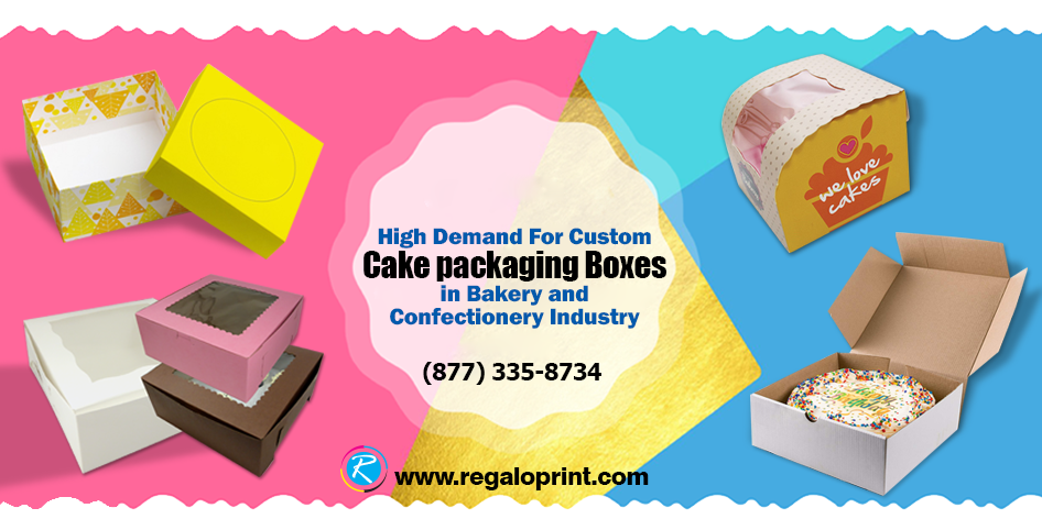
A window cut directly into the box face — sometimes bare, sometimes backed with clear film — removes the need to describe the product at all, because the customer is looking straight at it. This only works when the product itself is genuinely attractive on sight: baked goods, cosmetics with distinctive packaging of their own, textiles with visible pattern or texture. Putting a window on a product that doesn't photograph well undermines the box more than a closed panel would, since it's showing the customer exactly the thing that isn't selling itself. Windows also do double duty as a trust signal in food and gift categories, where "I can see what I'm getting" answers a hesitation before it forms.
Embossing and Debossing — Texture You Feel Before You Read
Embossing raises a design above the surface of the board; debossing presses it below. Both work without any ink or foil at all — the entire effect comes from light and shadow falling across a change in the board's surface, which is why it reads as the most understated of the finishing techniques and often the most expensive-feeling. A debossed logo on an uncoated or Kraft box is tactile in a way flat printing can never be — a customer's thumb finds it before their eyes do. It suits brands that want the premium signal without any visual noise: no color, no shine, just a deliberate mark left in the material itself.
What Finishing Actually Costs — and Why It's Not Always About Budget
Every one of these techniques adds a production step beyond standard printing: foil and embossing both require a custom die, spot UV needs a separate coating pass, and die-cut windows add a cutting operation and sometimes a film-application step. That means each one has a real per-unit and setup cost, and it's tempting to treat finishing purely as a budget question — add it if there's room, skip it if there isn't. That's the wrong frame. A single well-placed finish on a modest box style often reads as more considered than three finishes piled onto a generic one, because restraint itself is part of what a premium finish is supposed to signal. Spending the finishing budget on one deliberate touch, rather than spreading it thin across several, is usually the better call even when the total cost is identical.
Combining Finishes Without Overdoing It
Finishes can be layered — a debossed logo with a foil fill, or a windowed box with a spot UV border around the opening — but each additional technique raises the bar for why it's there. A useful test before adding a second or third finish: does it do something the others don't (add texture where there was only color, or add shine where there was only texture), or is it just adding cost without adding a distinct signal? A box carrying foil, spot UV, embossing and a window at once usually reads as busy rather than premium, because none of the individual techniques gets room to register on its own. The strongest finished boxes tend to use one primary technique and, at most, one supporting one.
Matching Finish to Category

None of these finishes fix a weak design or a poorly matched box style — they amplify whatever's already there. The right finish on the right product category is the difference between packaging that quietly confirms a customer made a good choice, and packaging that just adds cost without adding a signal anyone actually reads — start from a base box style in our packaging boxes range and layer the finish on from there.